
New Cultic Album Cover Gets Some Paint
It has been 8 months since I posted the initial sketch for the Cultic album cover. Cultic is a “Black-death battle punk,” band that my husband and I started last year. We’ve been steadily writing music and working on recording a full-length album, but the artwork has continued to fall to the wayside. It’s typical for my own projects to get stuck in limbo, but I’m making this a priority because we’re so close to having a finished album (and because I need a break from commissions for a bit so I can let-loose some of the pent-up inspiration in my brain).
I’m actually glad I had to wait so long to work on this piece. It allowed me to take a second (and third) look at it, and I ended up reworking the piece multiple times. A part of me wanted to be lazy with this one. When I initially drew it, I knew it needed to be a bigger scene with lots of activity, but I wasn’t feeling keen on drawing an entire battle and I was afraid to take-on something this complex. If this drawing wouldn’t have sat for 8 months, I probably wouldn’t have overcome my disinterest – so, I am glad that I got to stare at it and feel guilty for a while.

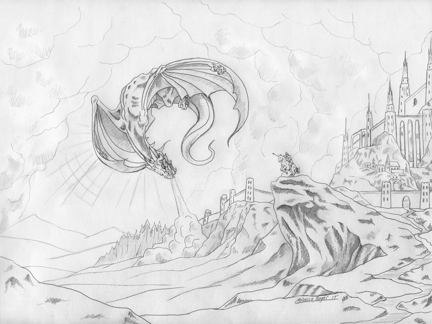
This initial sketch was ok, but, the drawing just wasn’t ‘there’ yet. It felt empty and disjointed. However, I did already have a concrete plan for the color scheme and had imagined the final piece being painted in a muted browns, blacks, greens and rust colors. I think I just instinctively knew it would need to use a classic palette because the subject matter is fairly over-the-top and I didn’t want to lose the seriousness of the piece. Sadly, because I wasn’t thrilled with the drawing, I put it aside for 8 months.
A few months ago (after making immense progress on writing and recording the album) I revisited the drawing. I had planned on tossing it completely and starting over, but Brian convinced me to reconsider. Instead of scratching the piece, I decided to fix it.
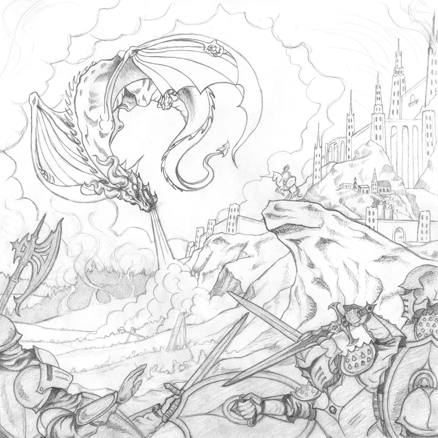
I knew it would need to fit better into a square format, so I brought the dragon closer to the king and brought the castle in tighter as well. The dragon grew-up a bit in order to dominate the scene, but I still didn’t feel like the piece was badass enough. The dragon was too cute and the whole scene fell dead without weapons, soldiers and activity going on. So, I reworked the dragon and spent a great deal of time doodling the final battle scene.
I knew I needed to plan my light and dark areas to bring the composition together and I knew it needed more depth overall. Adding the characters in the foreground helped to create the illusion of depth I was shooting for, but they also helped to complete the composition through use of lighting and shadows. With the foreground in place, I could envision the shadowed areas encircling the entire piece and creating a vignette with the lighter areas focused behind the dragon and the king. I think this circular motion is what brings all of the elements in the piece together, while the lighter areas help guide your eye to the focal points.
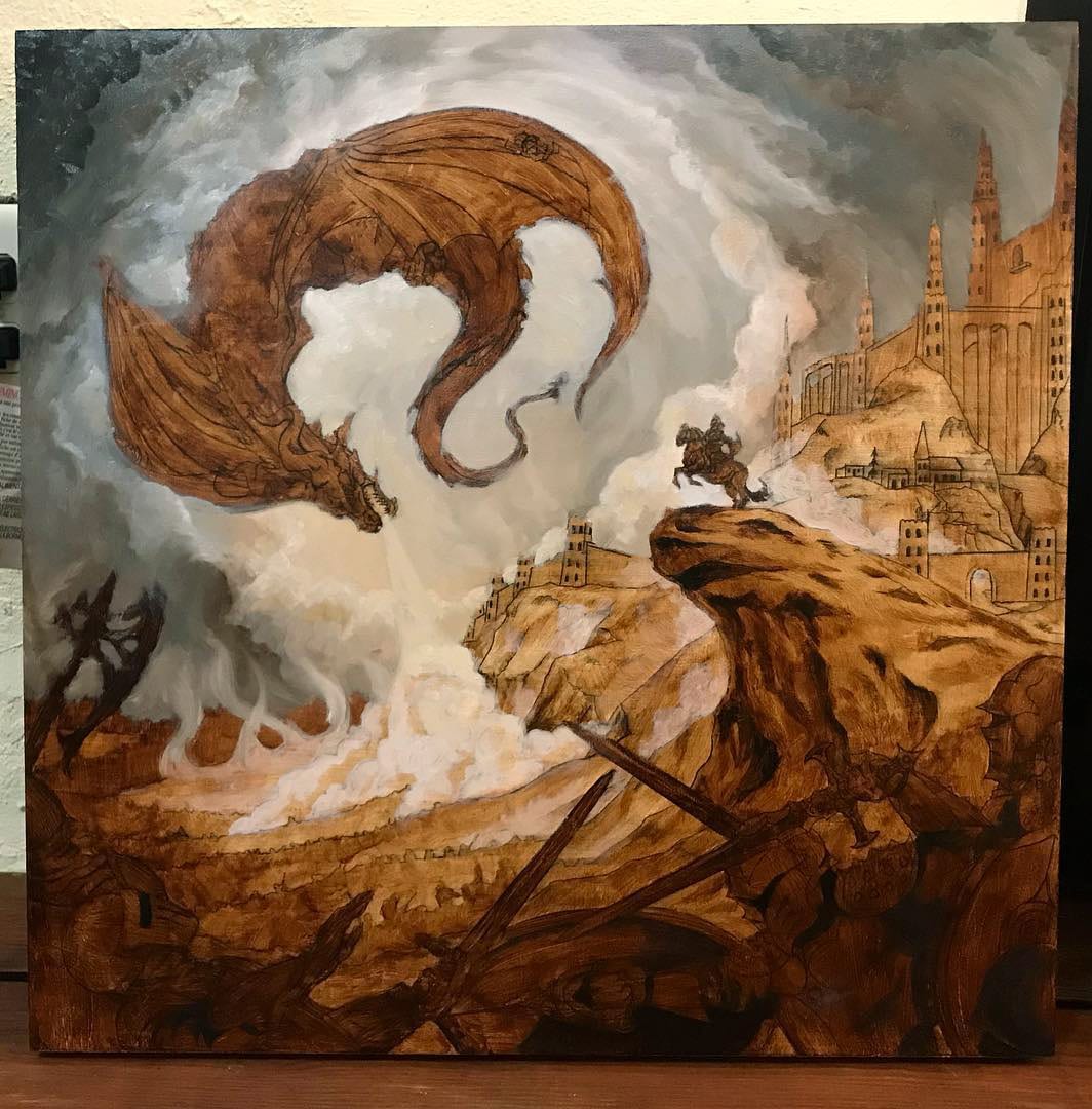
I opted to do an underpainting on this piece because I felt it would be necessary to test my lighting scheme, but also because it gives the painting that continuous, warm undertone that I was aiming for. I have only actually started painting the clouds in the background, but I am feeling really good about the direction this piece is going.
